Fair Search Redesign
How might we improve Fair’s search experience?
We aimed improve the search experience after talking to customers, conducting moderated tests, and uncovering points of friction during the search process.
I worked alone, syncing occasionally with the UX manager for feedback.
Deliverables
UX / UI design
User research
Team
Product Designer / me
UX Manager
Timeline
3 months (2019)
What is Fair and why are we doing this?
Fair, a unicorn startup, set out to revolutionize car ownership with a platform offering flexible, short-term car leases. When I joined, the company focused primarily on analyzing quantitative data to identify drop-offs in the user journey and monitoring reviews on social media. However, they had yet to address their usability challenges through a UX lens.
Goal
Understand core usability challenges and conduct a redesign.
Establish goals
To address these challenges, I collaborated with the UX lead to explore Google’s HEART framework, aiming to evaluate usability in a more accurate, efficient, and holistic way. For instance, metrics like app downloads or visits only tell part of the story—users might not convert to paying customers or have an optimal experience. A frustrated user spending more time searching for a car could artificially inflate engagement rates while failing to complete a checkout, delaying conversion.
By applying the HEART framework, we aligned our redesign goals with both business objectives and user needs. Our overarching goal became clear: “Helping people seamlessly find a car they’d be happy with.” We then broke this down into sub-goals tied to metrics such as happiness, engagement, adoption, retention, and task success. These metrics served as the foundation for evaluating the success of subsequent redesigns.
Success Metrics
Increase in conversion and task completion
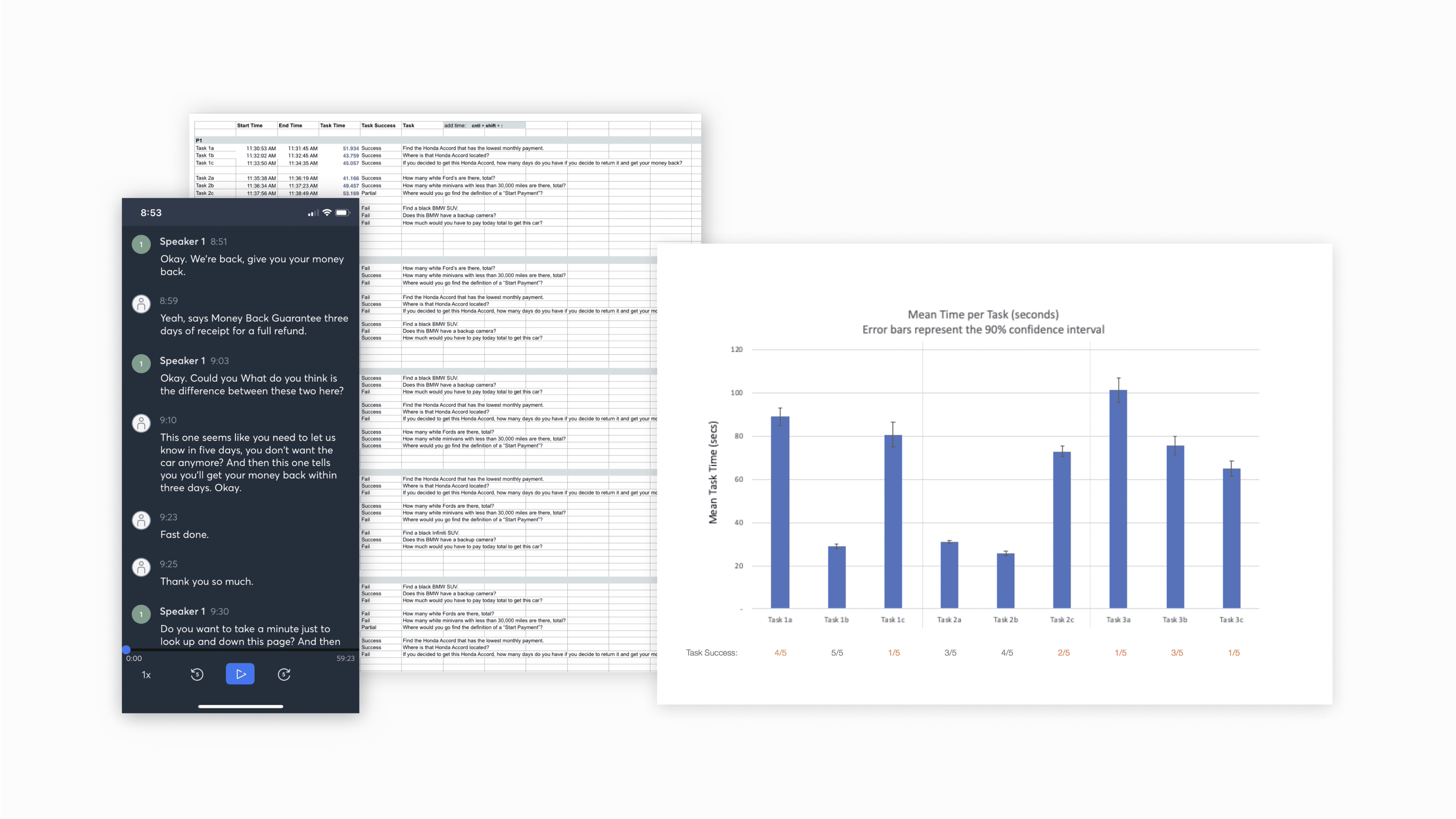
Time of task, time
Conducting user interviews
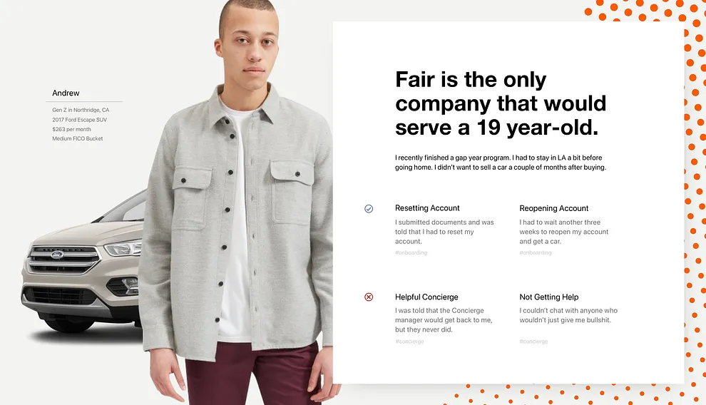
With our goals and metrics in place, I conducted user interviews with a cohort of approximately 25 customers who had recently secured a car through Fair, capturing their feedback while their experiences were still fresh. These interviews revealed that many users’ frustrations stemmed from the app's search and checkout process.
As a side project, I also designed discussion cards and presented them to the Product team. These cards helped spark conversations about which solutions to prioritize moving forward.
You can see this deck here.
Original Design
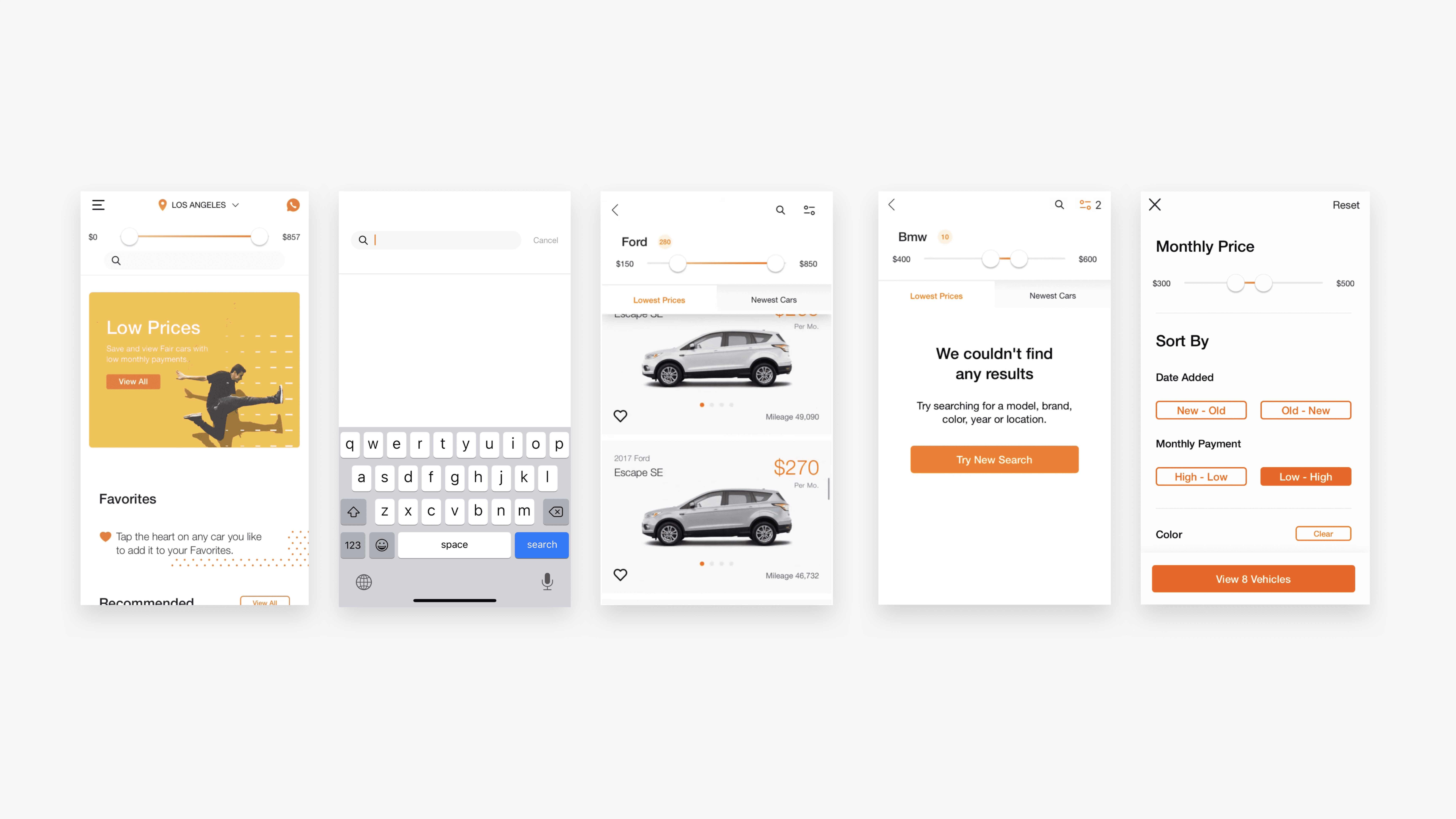
We used these screens to conduct moderated usability tests, providing participants with a list of tasks to complete. This approach allowed us to uncover critical usability issues that were causing users to drop off during the checkout flow. To keep things concise, I’ll highlight a select set of key problems and their corresponding solutions.
Insights
They misused the Search bar because they didn’t understand its constraints. They tried to use it the way they would use Google. A few participants with limited vision failed to find the Search bar in the first place.
People failed to understand if the cars were in their location and didn’t have confidence in the Location filter.
Customers were driven to purchase a lease with promotions but didn’t know how to find them and were constantly flooding the customer service center, which was a big deal because customer service specialists also had to serve customers who needed immediate roadside assistance.
Shoppers struggled to find specific builds. They failed to use “Newest Cars” and “Lowest Prices” filter tabs as intended
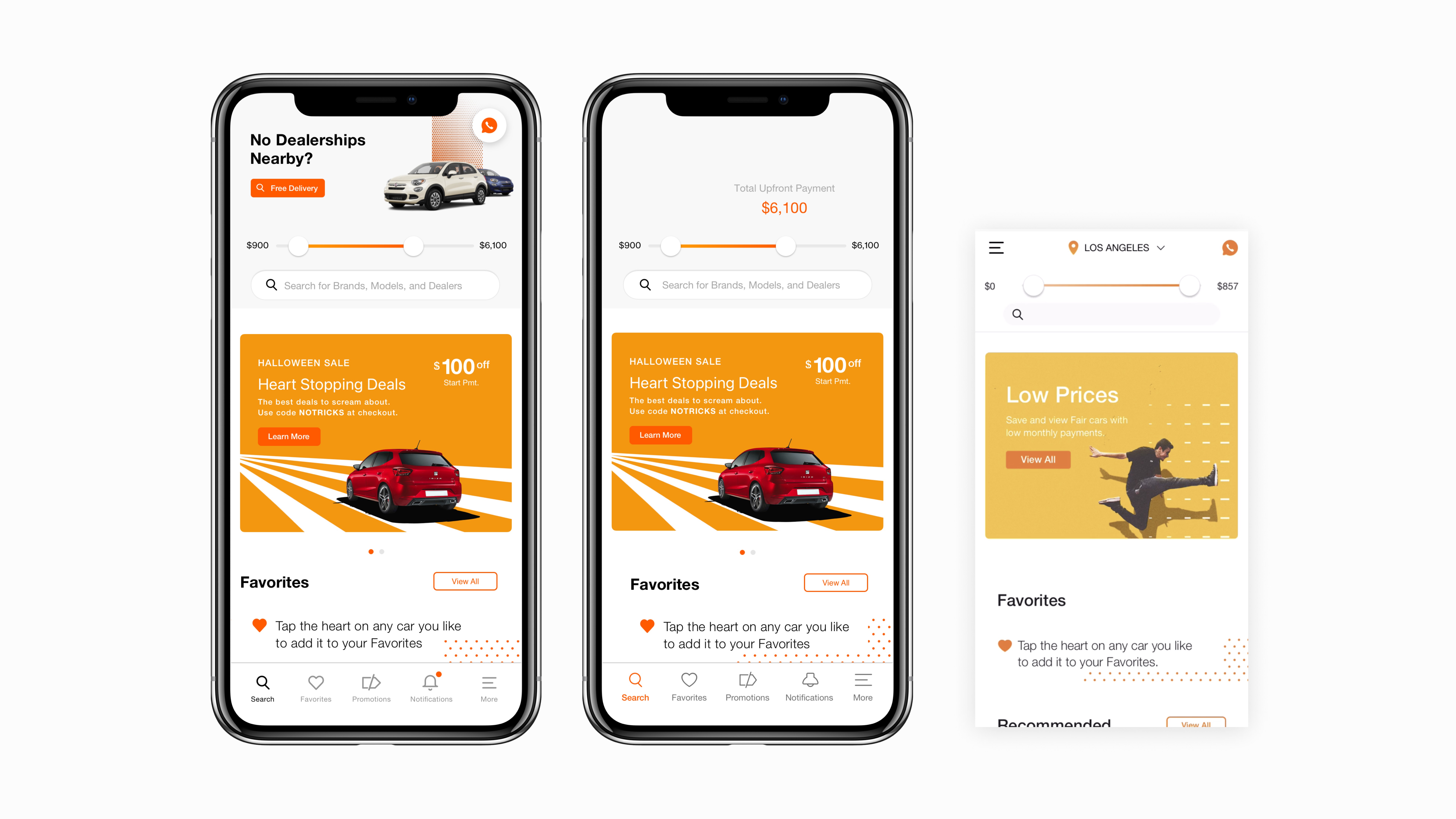
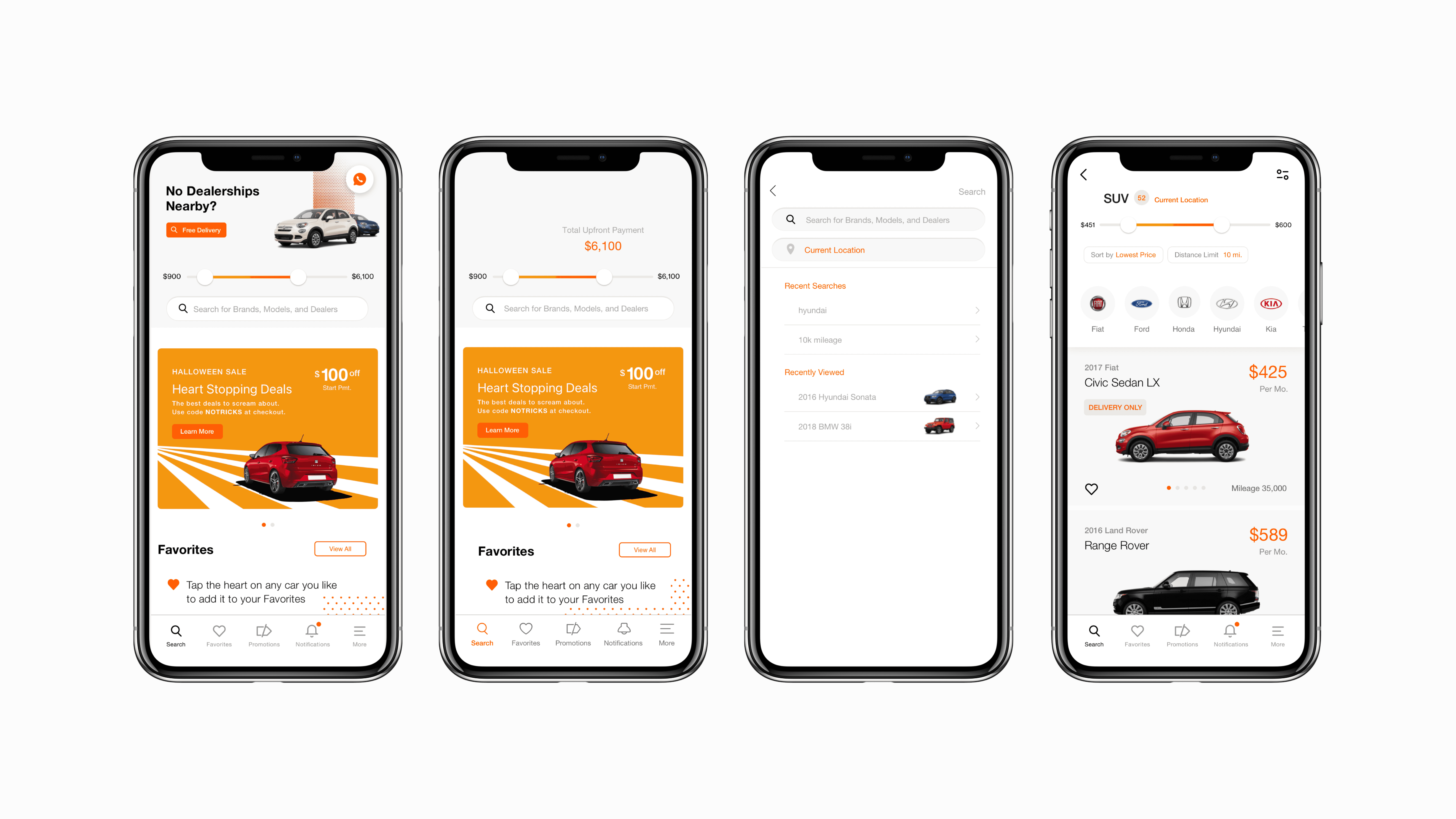
I redesigned the search and landing page by adding a gray background and a beveled design to the search bar, along with placeholder text to establish clear constraints. To improve navigation and usability, I introduced a bottom navigation bar with the following features:
Favorites Page: Allows users to save, recall, and compare cars easily, reducing browsing time and drop-offs.
Promotions Page: Displays current deals to streamline the selection and checkout process while reducing customer service inquiries.
Notifications Page: Alerts users to new car inventory additions, payment reminders, and other relevant updates.
Additionally, I refined the slider functionality for selecting ranges. The header now disappears when the slider is used, replaced by a dynamic text description of the selected range. This change provides users with greater clarity and control over their preferences.
Location & Sorting
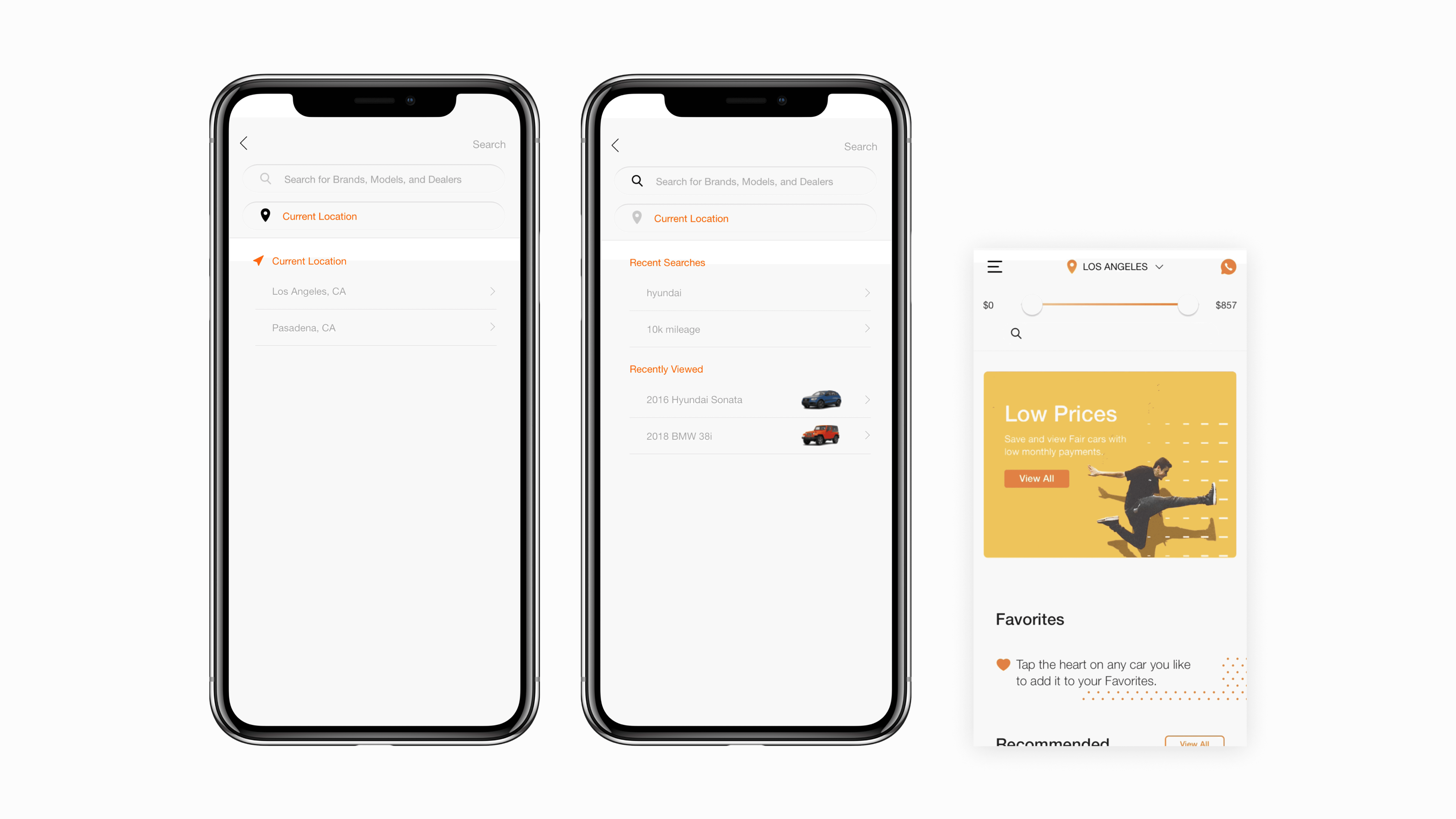
Users lacked confidence in the location selector because their feed often displayed cars from different cities, a result of limited inventory rather than a bug. Many users didn’t notice the location selector at the top, and it disappeared once they started a search.
To make location selection more intentional, I redesigned the flow so that tapping the search bar would open a page with input fields for both the search term and location.
Additionally, I included a section displaying users' recent searches and viewed cars, which was absent in the previous design. This helps users who may have second thoughts during the checkout process and want to revisit the inventory before finalizing their decision—without losing track of the car they originally liked. Many users also forget to "Favorite" cars during the browsing process, so this feature ensures they can easily return to items of interest.
Searching & Filtering
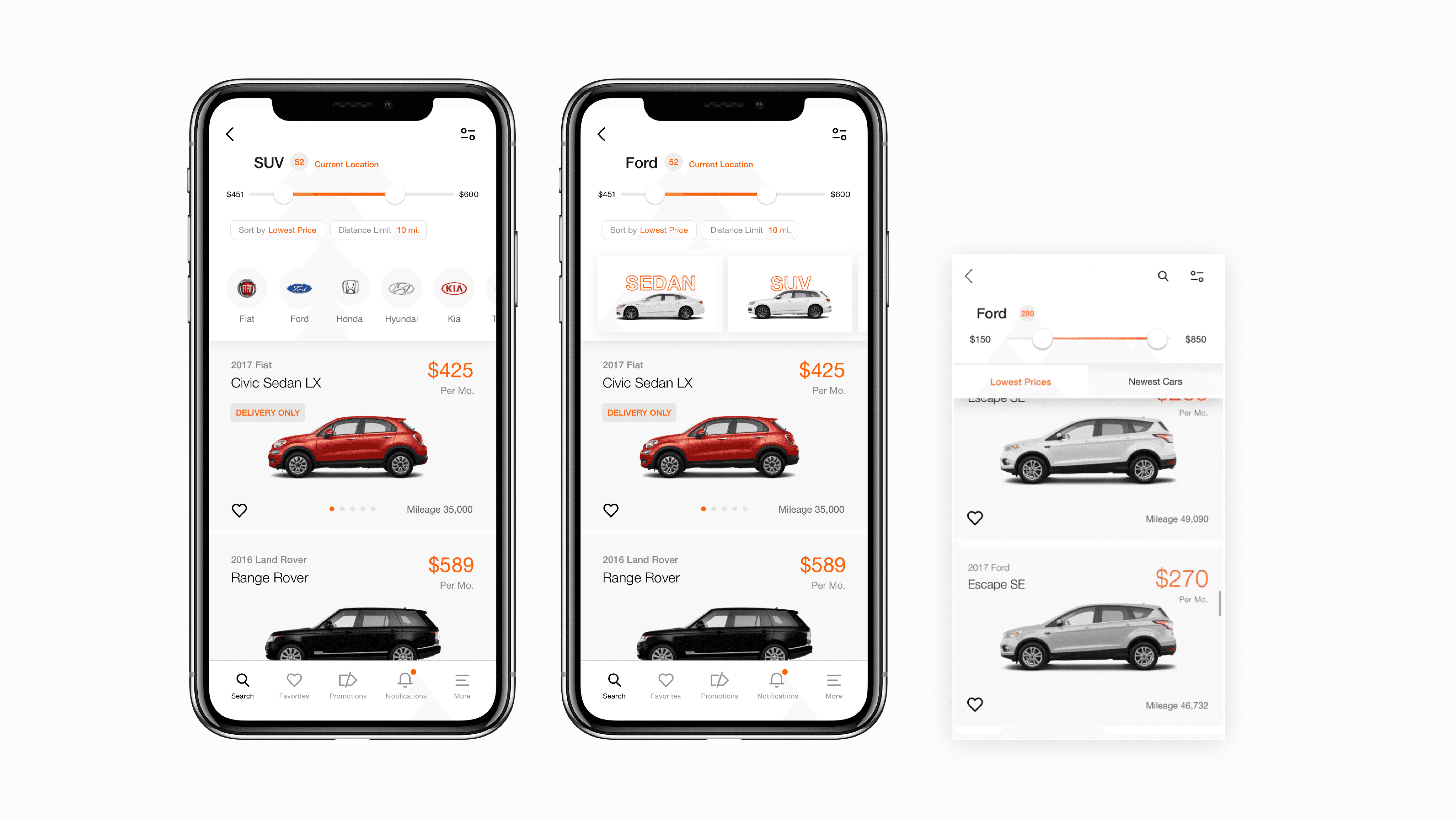
The tests revealed that the data-driven assumption that users wanted to filter by “Newest Cars” and “Lowest Prices” was incorrect. This decision had been made by the CEO to help users quickly find and narrow down their choices, aiming to speed up their decision-making process.
However, we found that most users assumed these were sorting options, leading to confusion when they saw only a few cars under each tab. Many didn’t even notice the second tab and believed the app was buggy because the number next to their search term didn’t match the actual number of cars, or they thought Fair had a limited and underwhelming inventory.
To address this, I redesigned the filters as sorting options, aligning them more closely with users’ mental models and expectations. I also redesigned search so that it aligned with users' existing behaviors— when users searched by body type, they saw a brand carousel. When they searched by brand, they saw a carousel with body types.
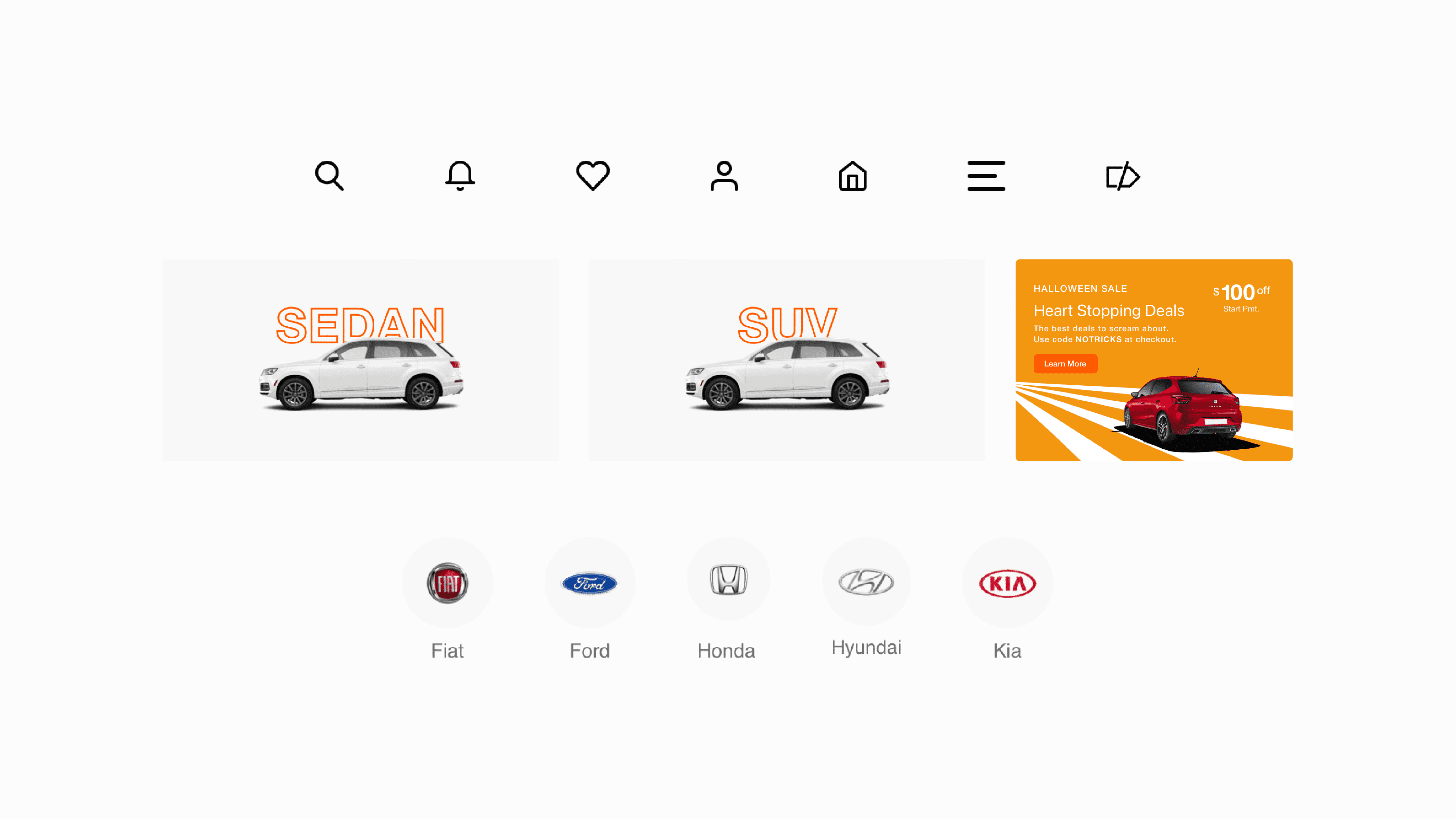
I also enjoyed creating design components and icons throughout this process. My goal was to develop visual assets that aligned with Fair’s design system and color palette.
Conclusion
I presented my findings and design recommendations to the Product team, which were met with enthusiastic approval and strong support. Unfortunately, just a few weeks later, due to SoftBank’s decision to pull their investment following the WeWork debacle in 2018, the company restructured, resulting in the layoff of the design team and the eventual shutdown of the app. Had this not occurred, I would have been eager to A/B test the designs, iterate based on user feedback, and collaborate with developers to bring them to life.
Despite the setback, I gained invaluable experience in fast and efficient guerrilla research methods. I realized that designers, by directly engaging with users and conducting research, could gain a more nuanced understanding of their needs. I also learned how to leverage qualitative data and design to drive C-level decisions, ultimately influencing the product strategy in a meaningful way.

